
Bestie!
Your packaging design is talking when you’re not.
If you sell physical products, wellness goods, or hospitality items. Your packaging aesthetic is shaping perception instantly.
And here’s the hard truth:
Minimalist packaging design does not automatically equal premium packaging design.
Modern packaging isn’t just beige and a serif font.
If you don’t have a settled brand identity, STOP! Creating packaging without an established brand identity and visual direction is an expensive mistake and will leave you with packaging that doesn’t feel like your brand.
The brands that nail it understand this:
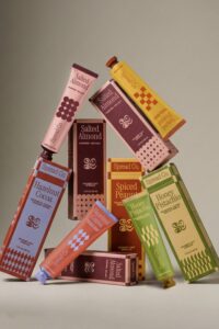
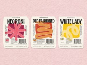
1. Hierarchy is Everything
Your packaging layout should guide the eye.
What do you want the eye to be drawn to first? What’s secondary after that?
If everything screams, nothing stands out.
When someone sees your product, their brain scans before it reads. Good packaging design controls that scan.
Your front panel needs one clear focal point. Maybe it’s the product name. Maybe it’s the benefit. Maybe it’s the brand name, but it can’t be all three at once.
This is where a lot of minimalist packaging design goes wrong. Founders try to keep it “clean,” but then make everything the same size and weight. And when everything has equal importance, nothing feels important.
Strong hierarchy creates confidence.
Large → medium → small.
Hero → support → detail.
Whitespace isn’t emptiness, it’s authority. It tells your customer, “We don’t need to shout.”
Great packaging layout is really just controlled storytelling.
Visual hierarchy can be difficult to understand in practice, so I recommend checking out this great article that breaks down the individual elements to look out for and how to optimise your design towards them.
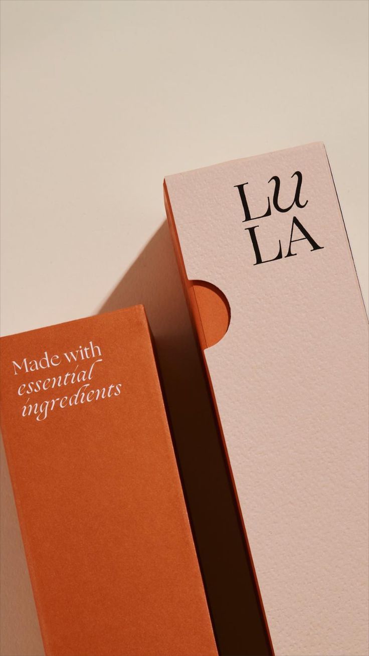
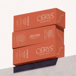
2. Texture & Finish Matter
Premium isn’t about looking expensive.
It’s about intentional choices.
Perceived value isn’t just visual, it’s physical.
Is your packaging matte or gloss?
Is the stock thick or flimsy?
Does it feel aligned with your positioning?
Wellness brand packaging often works because the texture supports the message: soft-touch finishes, natural paper, muted inks. It reinforces that grounded, organic branding design energy.
You don’t need foil and embossing everywhere. Sometimes, premium packaging design is as simple as choosing a warmer white, a heavier label, or a softer finish.
If your brand promises luxury but the packaging feels thin or shiny in the wrong way, the experience breaks.
The feel should match the promise.
3. Trends Aren’t Strategy
Yes, packaging design trends are fun.
Soft neutrals.
Organic branding design.
Muted greens.
Minimal serif logos.
But trends are aesthetics, not positioning.
If your brand is bold and expressive, forcing it into a beige minimalist packaging aesthetic just because it’s popular will make it feel watered down.
Modern packaging works when it aligns with your brand personality, not when it mimics what’s trending on Pinterest.
Use trends as inspiration.
Filter them through strategy.
Keep what fits. Drop what doesn’t.
If it doesn’t align with your brand positioning, it won’t convert into a successful brand.
That’s how you create packaging that lasts longer than a season.
4. Structure Communicates Value
Your packaging box design, label size, spacing- all of it contributes to perceived quality.
If you’ve ever designed packaging and then thought, ‘Why does it not feel as good as I imagined?’
It’s usually because the strategy came after the aesthetic.
That’s exactly why I created my guided workbook for no-regret packaging decisions.
It walks you through:
- Packaging inspo filtering
- Packaging template decisions
- Layout hierarchy
- Emotional positioning
- Long-term brand alignment
If you want to design packaging you won’t cringe at in six months, you can grab it here -> No-Regret Packaging Workbook
And if you love these kinds of honest brand chats?
You’ll feel right at home with my newsletter.
Leave a Reply