A timeless, mature, and unforgettable brand identity for Ediné, a Korean-inspired speciality coffee shop.
Ediné is an independent speciality coffee shop that creates an immersive, bold, and quality-forward customer experience from the moment you walk through the door. Working alongside Yeeun, Ediné’s founder and visionary, the focus for brand identity was to stand out from the competition while emulating the same timelessness and confidence often reflected in heritage luxury branding.
PROJECT SCOPE: Brand Identity, Packaging, Custom Stationery, Copywriting, Positioning
PROJECT DURATION: August 2025 – September 2025
TOOLS USED: Figma, Illustrator, Photoshop, InDesign
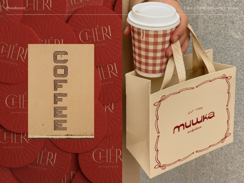
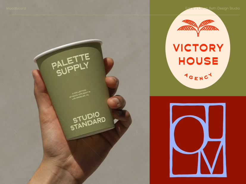
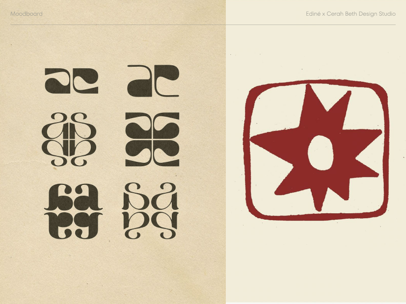
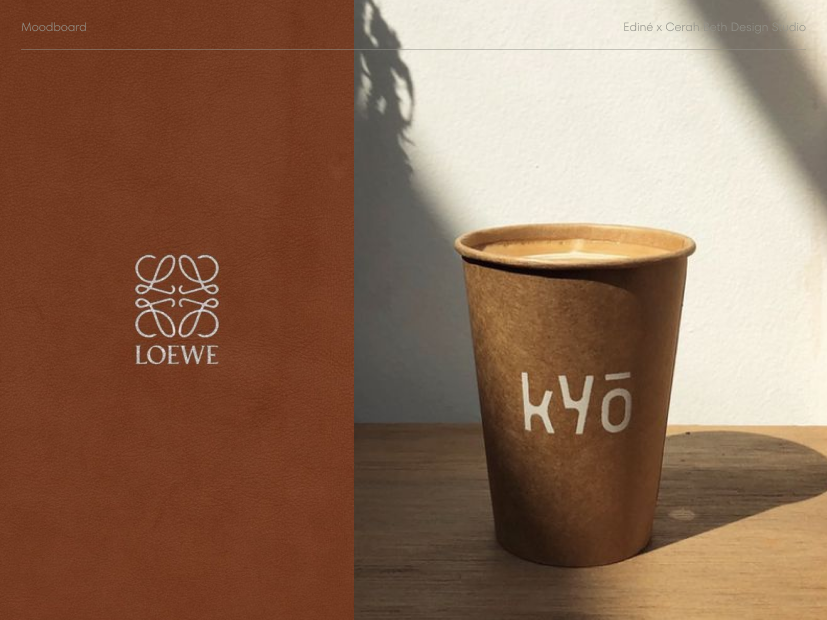
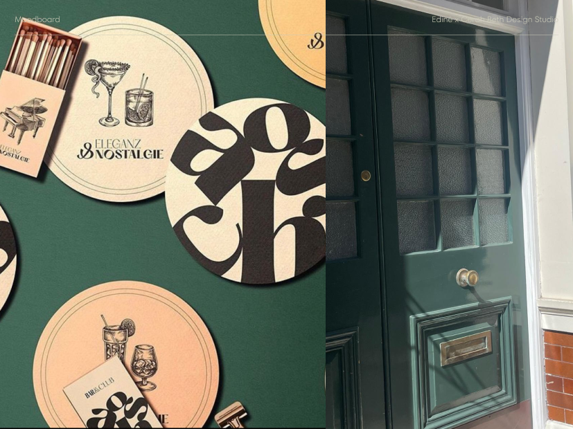
Moodboards
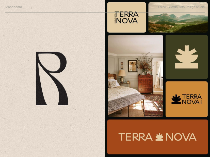
At the beginning of the design process, it was clear that we wanted to communicate calm, confident and un-intimidating branding that would be appealing to a wide range of customers. Taking inspiration from Korean culture and heritage branding, we established a moodboard that led us in the right design direction.
Logo Suite
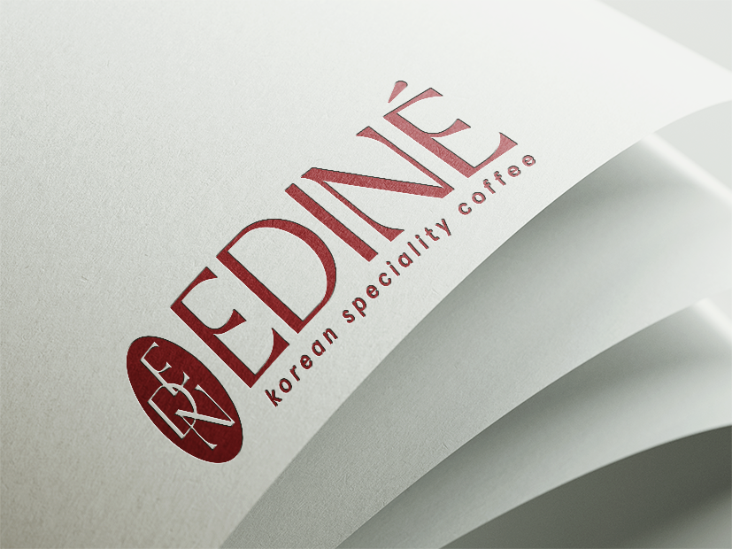
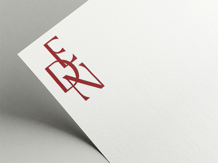
Together, we aimed to create a brand that exhibits maturity and timelessness through a bold and approachable aesthetic. With Korean influence at the forefront of design choices, we have created a visual identity that, above all else, screams “Ediné”.
Colours and Typography
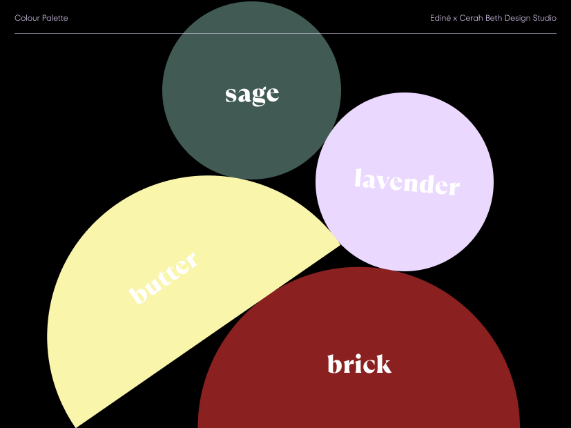
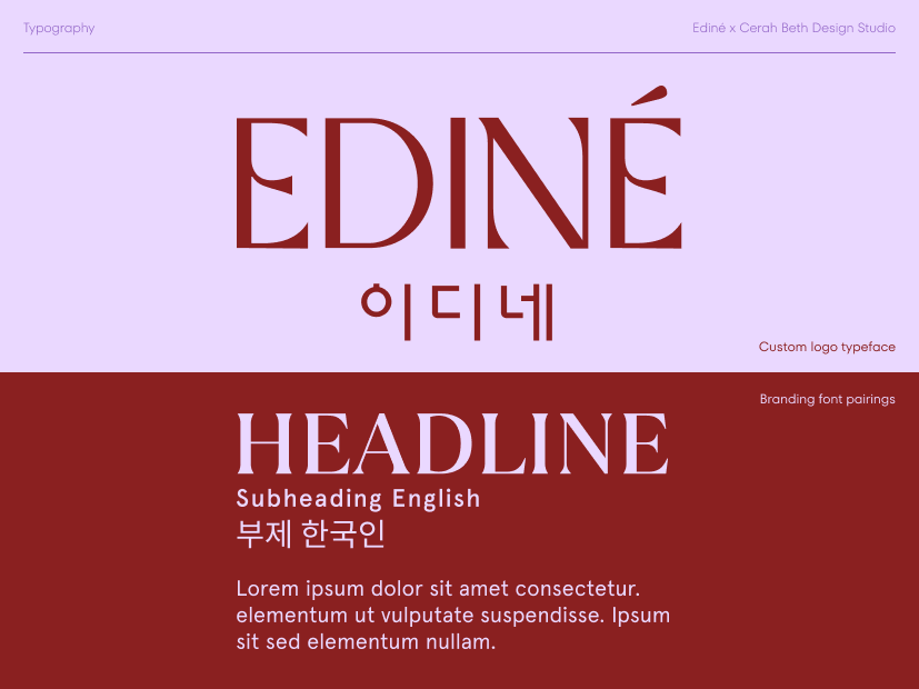
I created a custom typeface for Ediné’s logo suite, resulting in a one-of-a-kind branding package. Once again, we drew inspiration from heritage branding, focusing on readability and producing a typeface that would work seamlessly across all platforms and touchpoints. Colour palette included a pair of colours, brick and butter, to serve as primary branding colours and another pair, lavender and sage, to act as accents. Utilising these distinct pairs allows for flexibility in marketing campaigns and seasonal offerings while maintaining a cohesive brand presence.
Branding in Action
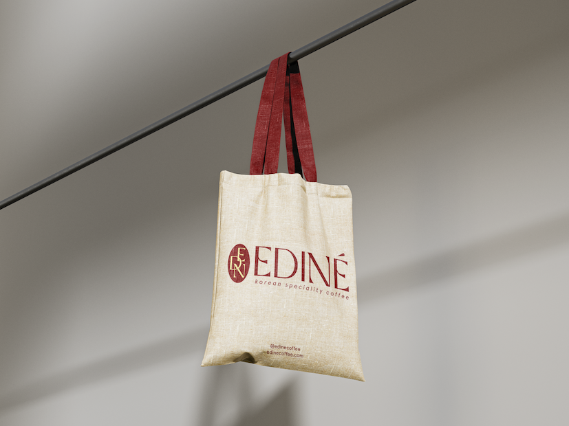
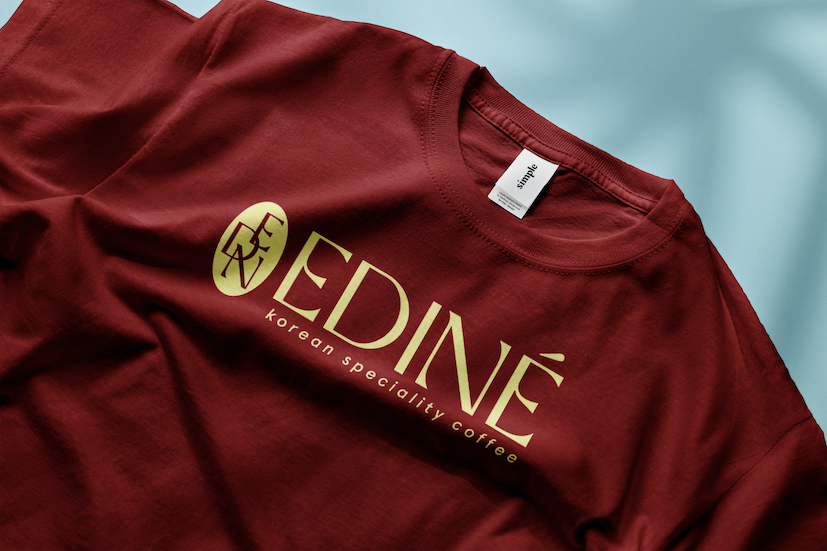
Designing custom packaging, stationery, and merchandise is hands down my favourite phase of the design process! At this point, the hard work of identity creation is done, and mockups allow us to visualise the branding in action, experiencing the designs we have created in a real-world application. Time to get excited about our designs!
MERCHANDISE: Tote bag, T-shirt
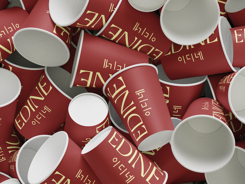
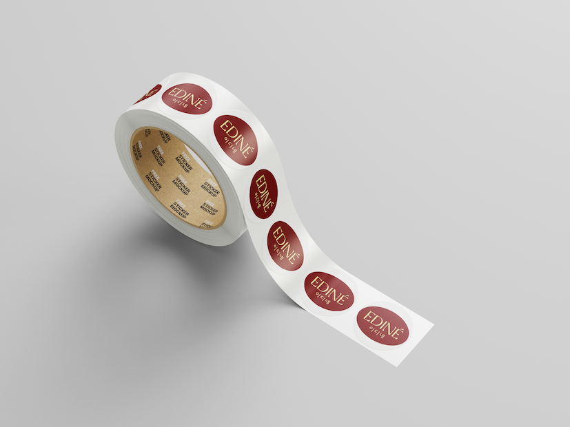
PACKAGING DESIGN: Takeaway coffee cups, stickers
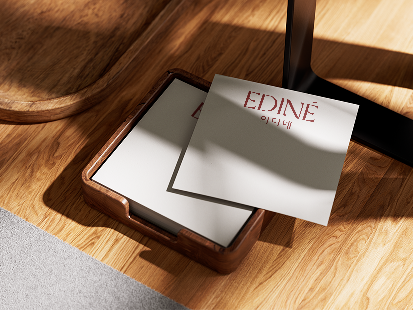
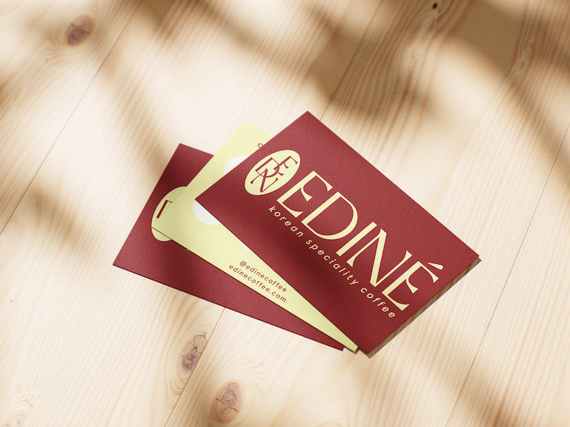
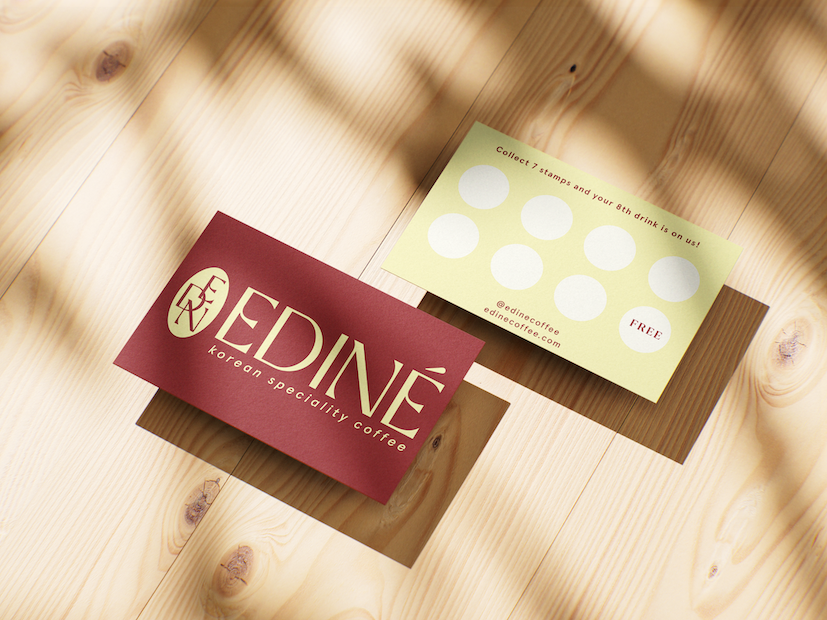
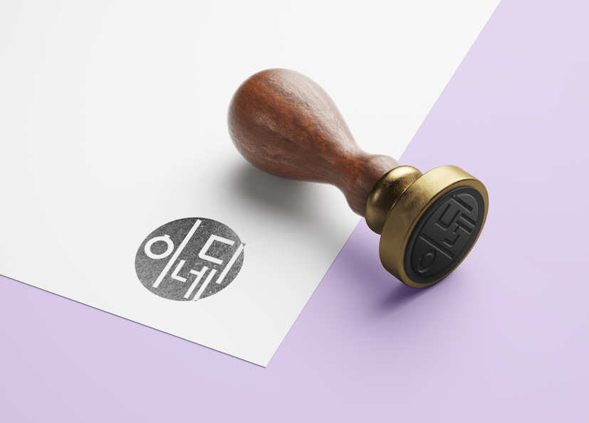
STATIONERY: Customer loyalty card, sticky notes, ink stamp

WHAT I LEARNED:
This was my first extensive project with from-scratch brand development, and I learned just how much I value collaboration and honing identities from scratch. Working within small time constraints, while challenging, allowed me to hone my design process to be more efficient and effective. I was blown away by what we were able to accomplish in the 3 weeks we had on this project.
WITH MORE TIME & RESOURCES:
I would love to work more on brand tone, online strategy, and creating more extensive packaging lines.
